Friday, 30 April 2010

Evaluation Activity 4....

How did you use new media technologies in the construction, research, planning and the evaluation stages?


In the research and planning stages I relied mostly on the internet using sites such as; YouTube, for watching and analysing other teaser trailers. Google, for any research and also to collect images. Empire website, to look at other teaser trailers and also film reviews. I used a website called SlideShare to upload a powerpoint to and then in turn upload it to blogger. I have used Windows Powerpoint, Windows Publisher and Windows Word to record work and ideas.


In each of the stages of my production I have used Blogger to record everything I have done, to upload all my work to and also to be marked through.


In the construction stages of my production I have branched out a bit, I have used the video camera and tripod to film the footage. Adobe Premier Elements to upload and edit my footage on. I have again used Blogger to upload all my work to and also YouTube to upload my final video to.


In the evaluation stages I have used Blogger to go back over all my work and to write up all my evaluation. I have used Windows Publisher and Adobe Premier Elements to use screen grabs from my film to evaluate and again Blogger to upload all of this.

Evaluation Activity 3...

I have already put my audience feedback video on my blog and also on video site YouTube although I have not had many electronic comments left. Many people have watched my film and seen my ancillary tasks and really liked it. All the actors who played parts in my teaser trailer said they loved it although from what I had explained they had a different final product in their heads. Many people said it left a lot to the imagination - which is what I was going for - and that it made them want to find out what happens.

The comments I had for my poster was that the style and the design were really good. Some people said that my poster didnt quite match my teaser trailer and from the poster they were expecting something different. Although in a way these are bad comments, having them not similar adds to the enigma of my production.

In what ways does your teaser trailer remind you of other teaser trailers?
My teaser trailer reminds me of other teaser trailers, firstly because of the length. My teaser trailer is less than a minute in length and is very fast paced. This is a key convention of teaser trailers as it does not give too much away but gives the audience an idea of what it may be about. Secondly I have used a mixture of titles and scenes in my teaser trailer, a convention used in many trailers. Through doing this the titles can create questions in the audiences mind, encouraging them to want to watch the full film and also, because I have not used dialogue in my teaser trailer, can give the audience the information they need. The soundtrack I have used has added to the mood and atmosphere of my teaser trailer. I have also at the end included the release date although not the films title and also the producer and actors. By not knowing the name of the film the audience should hopefully look out for more promotional items to find out more information, for example, the poster, more trailers ect.

What do you think are the strengths of your trailer?
I think one of the strengths of my trailer is the way in which I have edited it. I think without the titles I have used in between clips my trailer would not be of as much interest to my audience. The fast pace I have used along with the soundtrack adds to the mood and increases interest. I think another strength of my teaser trailer is the way in which all my clips flow together with the fades I have used.

What do you think are the weaknesses of your trailer?
I think the weaknesses of my trailer are; the amount of footage I filmed. If I were to do it again I would film a lot more footage to give me more choice when it came to editing. I would use a larger range of shot types and plan my filming more efficiently. If I were to edit it again I would also include a production company logo as without it I think my teaser trailer looks rather amateur. I think if I did it again I would also include more action shots as I dont think any of the clips really lets on what the story is about. I would also make my poster more similar to my film so there is no confusion.

Evaluation Activity 2....

Here is a video of some of my audience feedback. The video does not include the links between my teaser trailer and ancillary tasks. Both my promotional poster and magazine front cover feature the main character shown in my trailer. The poster also shows the title of the film and also the release date. It is designed exactly like a real promotional poster featureing the producers and actors and also the production company logo. The magazine front cover is for Empire, advertising a world exclusive, poster, interviews ect. As a real magazine would.

I am pleased with the outcome of the poster as the style of the picture and fonts used fitted exactly with what I wanted. The magazine front cover was more difficult to complete as it was difficult to get a picture suitable for what I wanted without a detailed background. I tried to use a similar style font to other magaznes. I have also included a barcode, price and date as with a real magazine.

Magazine Final Front Cover...


Ok, so here is my fincal front cover design. I have used red and clue for my colour theme and the girl on the frn is my main character in my film and also features on my film promotional poster.

Thursday, 29 April 2010

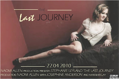
Final Film Poster...

Ok so here is my final film poster. The main picture is of the main character, the picture has nothing to do with the film which is the enigma of the poster. It makes the audience want to go and see the film. The poster includes the title of the film, the release date and the production company and main actors. The colours I have used compliment each other and the font used is modern and easy to read.

Naomi's media Coursework G324

Evaluation Activity One...

In what ways does your media product use, develop or challenge forms and conventions of real media products?

I have put together a mood board including ten different screengrabs from my teaser trailer, i am going to go through each in turn and write about how typical or not of teaser trailers they are.

Screengrab 1: Midshot of main characters, opening clip of teaser trailer.

This shot opens my teaser trailer, it is the shortest clip in the whole trailer and immediately introduces the two main characters to the audience. The fact that the shot is of two girls posing for a picture suggests to my audience the genre of the film, a chick flick. Hopefully my audience would be able to relate to the non verbal strucure shown through this shot as it is something they would do, and that this would make them want to continue watching and then go on to watch the film. The mise - en - scene of this shot shows two girls, dressed up and the connotations suggest they are at a party, again something my target audience can relate to.

Screengrab 2: Title, second clip of teaser trailer.

"No one said it was going to be easy"

Again another stereotypical convention of a teaser trailer. I have used titles throughout my trailer to assist the clips in telling the story and also to break the shots up and add interest. Many teaser trailers use titles as the clips used to not let the audience know anything about the actual story of the film and also they cause a reaction from the audience and make them think about what is going to happen.

Screengrab 3: Midshot of girl on phone, adds props and costumes, character profile.

In this shot one of the main characters is on the phone, this clip introduces props and also another location, her house. This is typical of a teaser trailer as it is building up the story without giving away too much. Stereotypical props and costumes of modern teenagers are also easy for the audience to relate to.

Screengrab 4: Over the shoulder shot, mid shot, two main characters.

Using this shot I have used a different style of camera angle. Using this angle shows the two characters having a conversation and mixes up the different clips. It allows the audience to see both characters from different angles.

Screengrab 5: Long shot, character getting into the car in the dark.

This shot is the first shot of the trailer shot in the dark. It immediately shows the change in the mood from the happy beginning of the trailer to the darker, miserable ending. Having a car and being able to drive is a benefit that only an older teenager can have so this is also easy for the audience to relate to.


Screengrab 6: Long shot of two characters having a fight, in the dark.

This shot is also shot in the dark and is a long shot showing the two main characters having an argument. I had to use a spotlight to shoot this clip. This shot really relays the change in mood from the beginning and end. This is typical of a teaser trailer as it shows part of an event which happens in the film, without showing what caused it and what the result of it was.

Screengrab 7: Shows the fase between a clip and a title.

"Embarking on a difficult journey"

Screengrab 8: Shows the end credits: Producer and director, actors and camera work.

Screengrab 9: Low angled shot of character on bed in phone. Shows different costumes and different location, her house.

Screengrab 10: Long shot from the side of characters at train station.