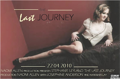


 Ok so here is my final film poster. The main picture is of the main character, the picture has nothing to do with the film which is the enigma of the poster. It makes the audience want to go and see the film. The poster includes the title of the film, the release date and the production company and main actors. The colours I have used compliment each other and the font used is modern and easy to read.
 In what ways does your media product use, develop or challenge forms and conventions of real media products?
This shot is the first shot of the trailer shot in the dark. It immediately shows the change in the mood from the happy beginning of the trailer to the darker, miserable ending. Having a car and being able to drive is a benefit that only an older teenager can have so this is also easy for the audience to relate to.
Screengrab 6: Long shot of two characters having a fight, in the dark.
This shot is also shot in the dark and is a long shot showing the two main characters having an argument. I had to use a spotlight to shoot this clip. This shot really relays the change in mood from the beginning and end. This is typical of a teaser trailer as it shows part of an event which happens in the film, without showing what caused it and what the result of it was.
Screengrab 7: Shows the fase between a clip and a title.
"Embarking on a difficult journey"
Screengrab 8: Shows the end credits: Producer and director, actors and camera work.
Screengrab 9: Low angled shot of character on bed in phone. Shows different costumes and different location, her house.
Screengrab 10: Long shot from the side of characters at train station.

This is the UK trailer for " The Last Song". I like this trailer because the fonts used are modern and work well with the colour schemes used. It is enjoyable to look at and I like the way they have faded the pictures into each other. The colours all work well together and the different sized fonts add interest. Although this poster includes lots of information about the film such as, title, release date, actors, directors ect. my poster will not include as much information although I would like to use a similar font and arrange my pictures in a similar way.
 In contrast to The Last Song, this poster contains only one picture. The connotations of this picture are that it is about a guy, who possibly isnt that good looking and a beautiful women and he tries his luck with her. This poster incluse the title, release date and directors, producers ect. Again I really like to fonts used and the different colours add interest. "How can a 10 go for a 5?" supports the connotations of the picture and is possibly a catchphrase from the film.
 This poster is slightly different to the others I have chosen as it introduces the audience to all the main characters in one go. Although "The final chapter" is not the title, as it is the fourth film in a series, pragmatically the audience will understand this. A large "S" which the audience can also connect with previous Shrek films take up most of the poster and then the characters smaller at the bottom. The trailer includes the release date, and production companies. I like the pragmatics and connotations involved in this poster although this is not possible for my poster as it is the first film made. This poster is closest to the one I would like to design as it only gives away release date and not the title, director or actors.
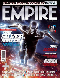
 This is the front cover for Empire magazine. It is released monthly and contains reviews and information about all new releases and new upcoming films. The cover is packed full of information and interesting to look at. The title and font used is the same each month. It also has a large picture and then subheadings about the articles inside the magazine. As with everyth magazine it has the date, price, website and a barcode. Hopefully when I am finished my magazine front cover will look similar to this.

La Casa Muda: (Latin American film, first one to be filmed with a proffesional photo camera and it was filmed in one single 72 minute sequence shot.)
I like this poster because of the polaroid effect it uses. It doesnt give much away, just the title, a slogan and a website. It uses one big picture of who assumingly is the main character and suggests by the slogan "Real fear in real time" that it is a horror movie. This is also suggested by the blood in the picture and her facial expression.
The poloroid pictures used over the top of the main image are similar to the pictures that would be used in a police investigation and add to the mystery behind the films story line.


